Micro-segmentation
Firewalls are no longer enough to secure the network. How can we make it easier for non-network IT admins to select which apps can interact with each other across the network?
Project Details
Company
Nutanix
Duration
1 year (2016-2017)
Team
1 PM, 2 UX designers*, 1 visual prototyper, 2 dev leads
*While the designers ideated together, all low/medium fidelity work presented here is my own.
Main Skills
UX Design, UI design
Background
Security policies dictate network traffic paths
A security policy is a set of rules that indicate which IP addresses can communicate with other IP addresses. Without any security policies or external firewall, any machine can talk to any other machine on the network, even malicious ones controlled by hackers. Firewalls are a great first defense, but hackers have historically infiltrated firewalls. Adding additional security policies within a firewall will make security more fine grained by further limiting communication to only what’s necessary.
Iteration 1
Low-fidelity proof of concept to engage stakeholders
Security policies can be composed of three parts: a target group, a source, and destination. Since we are securing apps, the target group is the application, and the admin must be able to specify which IP addresses the app can receive incoming connections from (sources) as well as to which ones the app can send outgoing connections (destinations). This led us to create an initial visual approach to help admins create a mental model around what network traffic means and also engage senior leadership.
As the user fills out the security policy, they would be able to see the effects on the machines in (seemingly) real time. We hypothesized that seeing the effects in real time would increase comprehension of what could talk to what.
Iteration 2
Balancing a form UI layout with visuals
Iteration 1 stakeholder feedback indicated that it was unclear what parts of the diagram were affected by what parts of the form. To help associate the visual with a traditional form, I changed the form layout to mirror the visual, still working in low/medium-fidelity. However, now the form and visual were so similar that people were questioning why have both? We needed to figure out how to strike the perfect balance between a form and a visual.
Iteration 3
Combine the form and visual and progressively disclose information
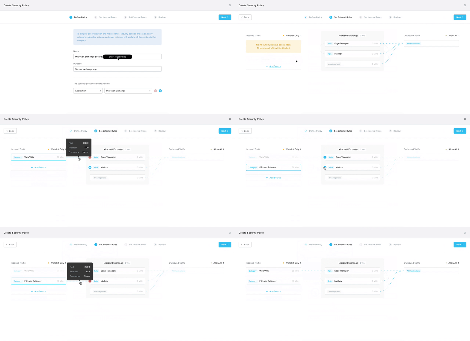
In addition to consolidating the form and visual, I broke down the policy configuration into four steps to progressively disclose information, lowering cognitive load.
With a suggestion from my co-designer, we added in smart automation to detect what traffic flows are already happening to the selected app. That way, all the admin has to do is click on the IP address they want to allow, and the system automatically detects the ports and protocols (the communication channel).
By progressively disclosing information, we would teach the user what means what in the diagram in consumable pieces. This is the prototype my co-designer user tested at a work conference shortly after I created it.
User Testing
The visual was crucial to enhancing understanding
After my co-designer tested the prototype with 6 potential users, we learned that the visual enhanced understanding of security policies. With a given scenario of setting up a particular security policy, 5/6 users understood which machines were allowed to talk across the network after saving the policy.
Iteration 4
Prototyping goes a long way
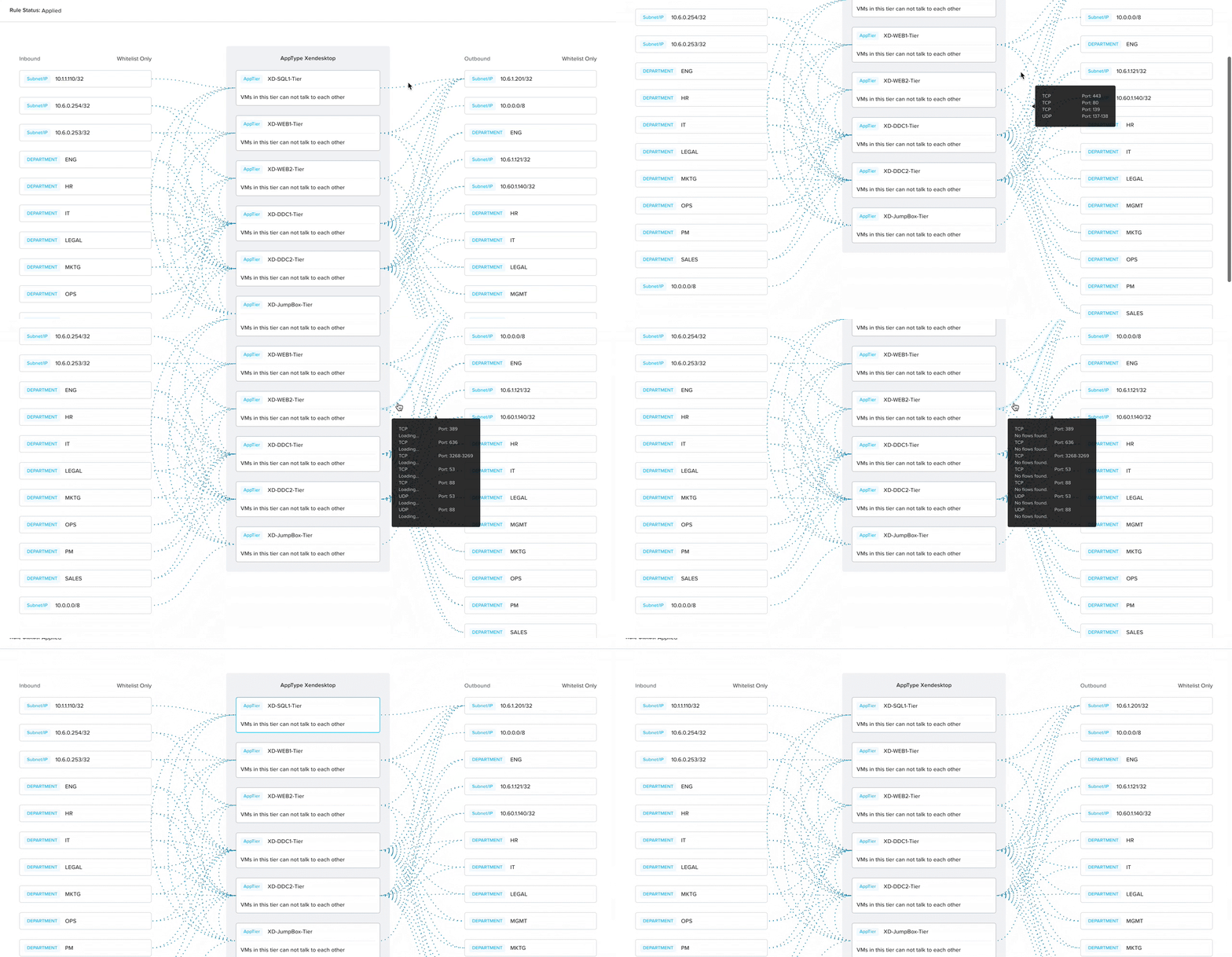
At this point in the process, I onboarded the UI designer to handle the next stage of the design process. He updated our circular machines to rectangles to fall in line with our design system and embedded the rule creation process (port and protocol specification) into the visual itself.
As a result, some of the ease of interaction and UX was lost (which I later conducted 13 usability tests to confirm), but we ended up with a more aesthetically simplified result.
I did not produce the following prototype but am sharing it for completeness.
Iteration 5
Additional requirements added complexity
While the visual designer created a sample prototype of the new interaction, it could not capture all the complexity that the product requirements specified. Using the prototype as a visual guideline, I created the final high-fidelity mockups to detail all edge cases and additional requirements that surfaced late in the product development process.
The final workflow was a three step process where the admin would specify policy details, select the app, add allowed traffic flows, and review before saving.


